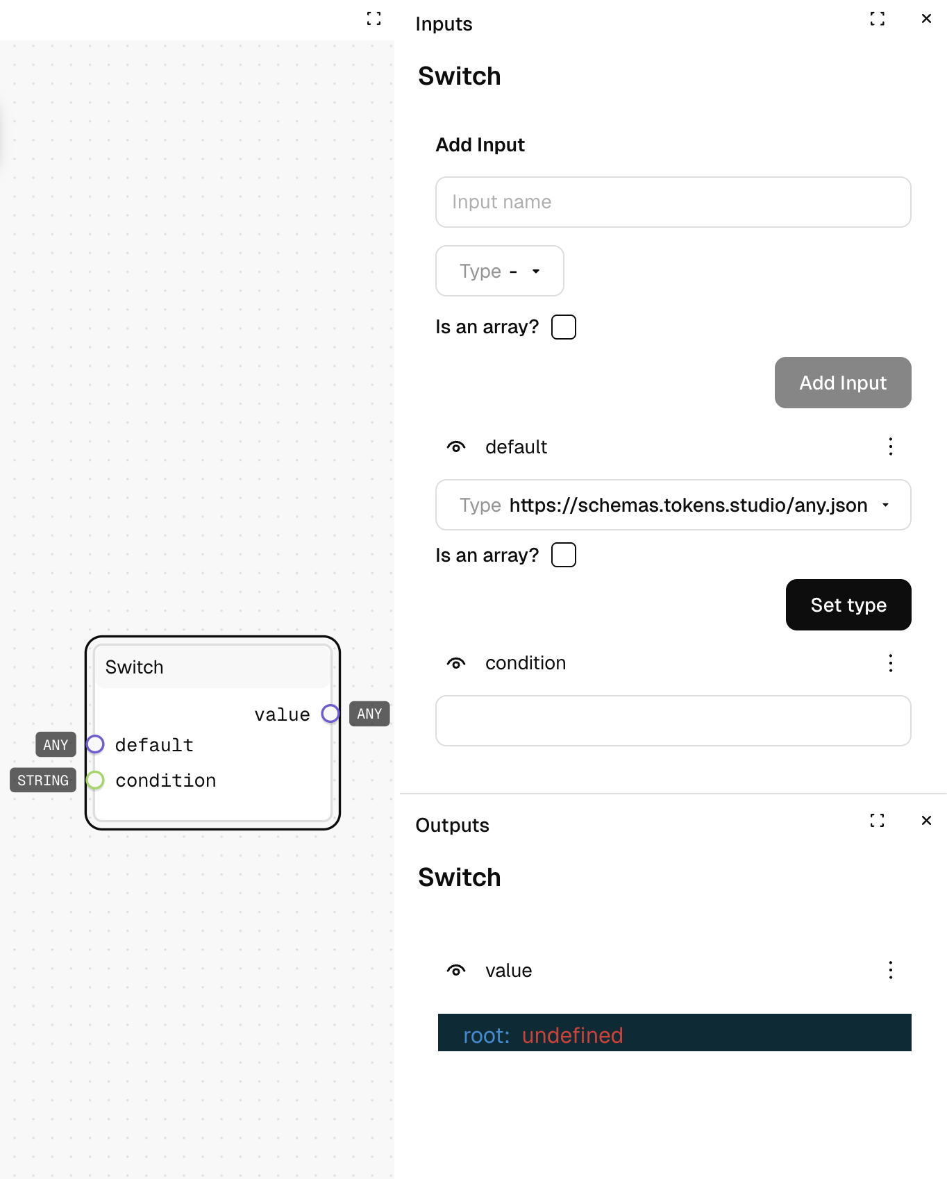
Switch
What It Does
Selects a value from multiple inputs based on a condition string that matches an input name. It's like a multi-way IF statement, perfect for selecting between many alternative values.
Inputs
| Name | Description | Type | Required |
|---|---|---|---|
| condition | The name of the input to select | Text | Yes |
| default | The fallback value if no match is found | Any | Yes |
| [custom inputs] | Additional named inputs you can add that match condition values | Any | No |
Outputs
| Name | Description | Type |
|---|---|---|
| value | The value from the selected input (or default if no match) | Any |
How to Use It
- Drag the Switch node into your graph.
- Add custom inputs with names that match your possible conditions (e.g., "small", "medium", "large").
- Connect values to each input (different spacing values, colors, etc.).
- Connect a text string to the "condition" input to determine which value is selected.
- Run the graph—your output will be the value from the matched input name.
Tips
- Make sure to set a meaningful default value for when the condition doesn't match any input name.
- You can add and remove inputs directly in the node UI to match your condition options.
See Also
- If: For simpler true/false conditions with just two options.
- AND/OR: For creating complex conditions before a Switch.
Use Cases
- Responsive Breakpoints: Select different sizing values based on a screen size name.
- Theme Selection: Choose between multiple theme values based on a theme name.
- State Management: Apply different styles based on a component state name (idle, hover, active, disabled).