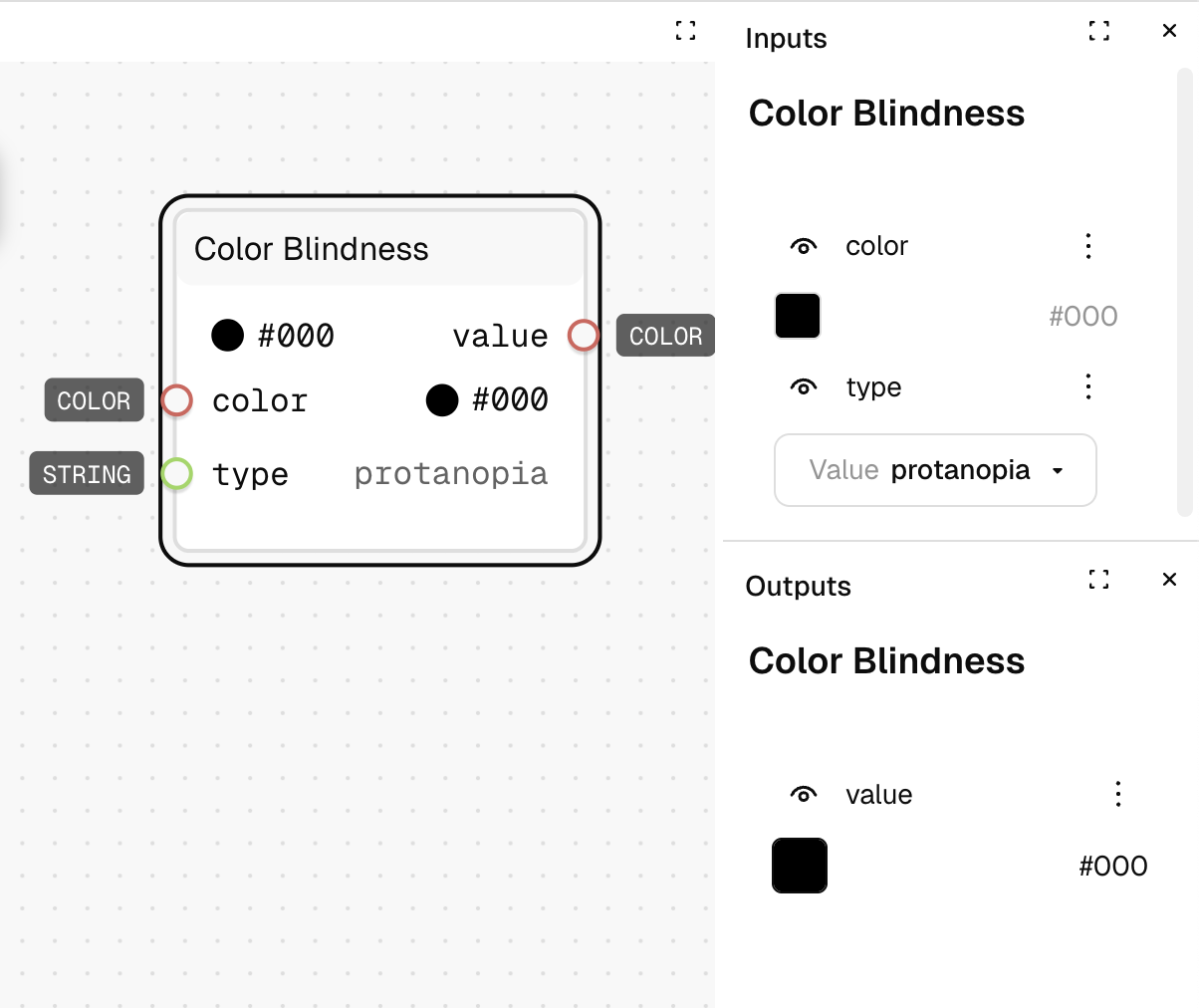
Color Blindness
What It Does
Simulates how colors appear to people with different types of color blindness. This helps you check if your design token color palettes remain accessible and distinguishable for users with color vision deficiencies.
Inputs
| Name | Description | Type | Required |
|---|---|---|---|
| color | The color to simulate color blindness for | Color | No |
| type | The type of color blindness to simulate | Text | No |
Outputs
| Name | Description | Type |
|---|---|---|
| value | The color as it would appear to someone with the specified color blindness | Color |
How to Use It
- Drag the Color Blindness node into your graph.
- Connect a brand color token (like
#0066CC) to the "color" input. - Select a color blindness type (e.g., "protanopia" for red-blind vision) from the dropdown.
- The output will show how that color token appears to someone with that type of color vision deficiency.
- Connect this to a
Contrastnode with your background color to verify accessibility standards are met across all vision types.
See Also
- Contrast: Tests the accessibility of text against background colors for WCAG compliance (see
color/contrast.md). - Color Scale: Generates accessible color scales that maintain distinctiveness across vision types (see
color/scale). - Deconstruct: Breaks down colors into components to modify after testing for color blindness (see
color/deconstruct). - Blend: Helps adjust colors that have poor visibility in certain color blindness modes (see
color/blend).
Use Cases
- Design System Validation: Test your entire color token system to ensure sufficient contrast and distinguishability across all color blindness types.
- Accessible Component Tokens: Verify that your UI component color tokens (buttons, alerts, form states) remain functionally distinct for all users.
- Data Visualization Token System: Develop a specialized set of color tokens for charts and graphs that maintain information hierarchy for users with deuteranopia (the most common type).
- Dark/Light Theme Testing: Verify that your theme token transitions maintain accessibility across vision types.