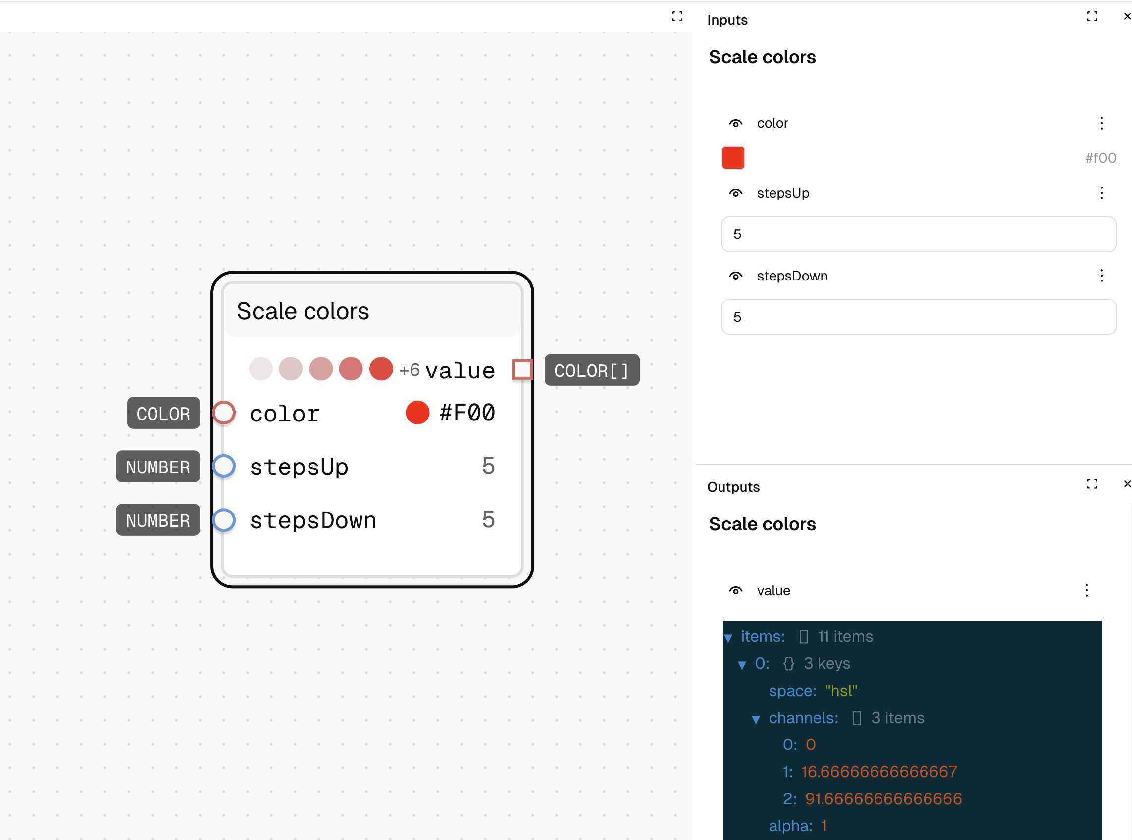
Scale Colors
What It Does
Creates a palette of related colors by generating lighter and darker variations of a base color. This is perfect for building comprehensive color scales or creating light and dark variants for UI elements.
Inputs
| Name | Description | Type | Required |
|---|---|---|---|
| color | The base color to create variations from | Color | No |
| stepsUp | Number of lighter variations to create | Number | No |
| stepsDown | Number of darker variations to create | Number | No |
Outputs
| Name | Description | Type |
|---|---|---|
| value | Array of colors with lighter variations followed by darker variations | List |
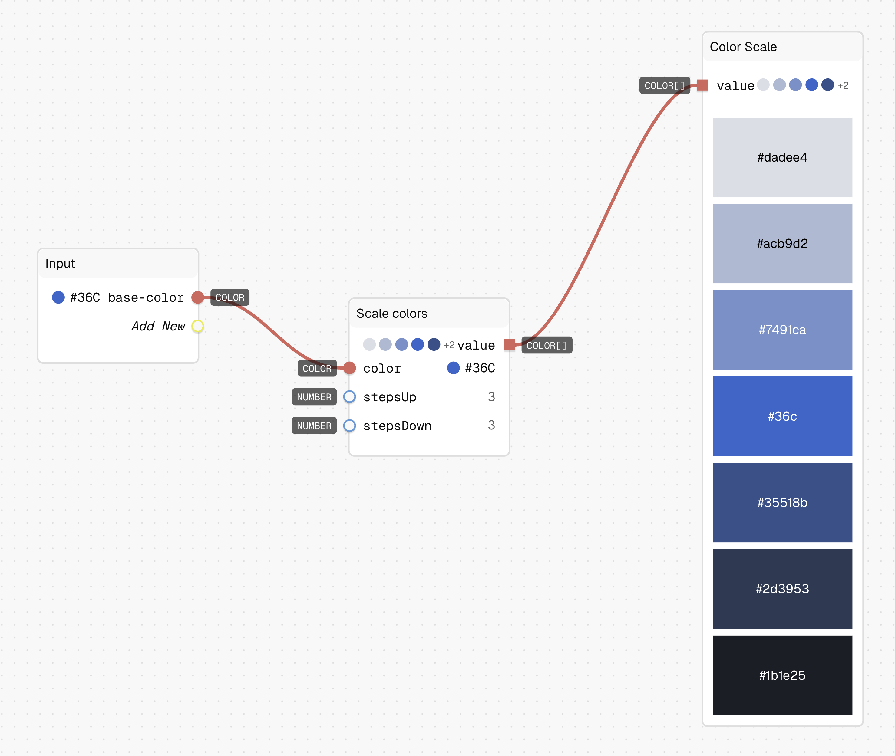
How to Use It
- Drag the Scale Colors node into your graph.
- Connect your base color (like
#3366CC) to the "color" input. - Set "stepsUp" to the number of lighter variations you want (e.g., 3).
- Set "stepsDown" to the number of darker variations you want (e.g., 3).
- Run the graph—your output will be an array of colors with your base color in the middle.
- Drag in a Color Scale preview node to visualise the colors.
Tips
- The colors are arranged from lightest to darkest in the output array.
- Use this to quickly create semantic UI color scales (e.g., primary-100 through primary-900).
See Also
- Range: For creating a color transition between two different colors.
- Lighten Color: For simple lightness adjustments to a single color.
Use Cases
- UI Component Libraries: Create complete color scales for buttons, alerts, and other UI elements.
- Background Variations: Generate lighter and darker backgrounds for different UI states and hierarchies.
- Design System Scales: Build systematic color scales with consistent lightness steps for your design system.