Contrasting Color
What It Does
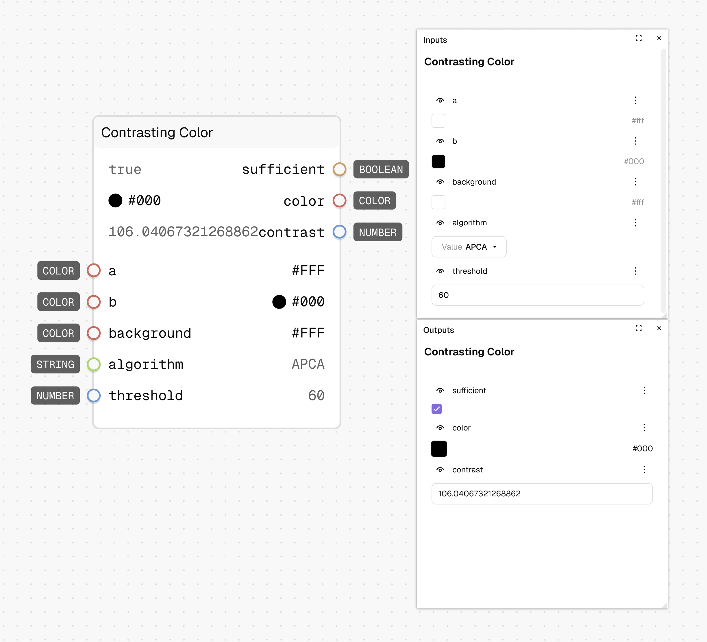
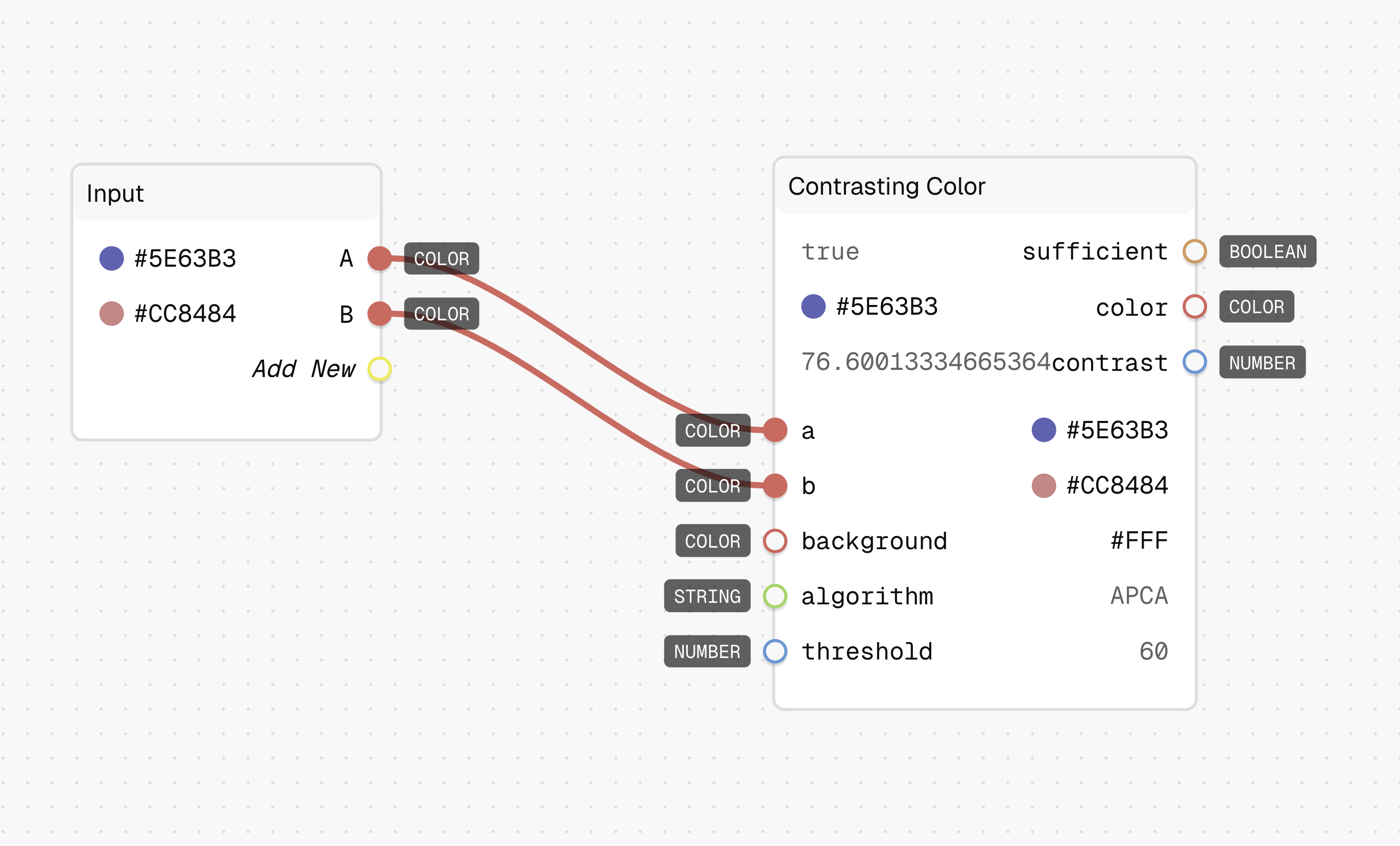
The Contrasting Color node evaluates two colors against a background and selects the one with better contrast. It uses contrast algorithms like APCA to determine which color has higher visibility against the specified background.
Inputs
| Name | Description | Type | Required |
|---|---|---|---|
| A | First color option | Color | No |
| B | Second color option | Color | No |
| Background | The background color to test contrast against | Color | No |
| Algorithm | Contrast calculation method (APCA is default) | String | No |
| Threshold | Minimum contrast value considered sufficient (default: 60) | Number | No |
Outputs
| Name | Description | Type |
|---|---|---|
| Color | The color with the higher contrast ratio | Color |
| Sufficient | Whether the contrast meets the threshold requirement | Yes/No |
| Contrast | The contrast ratio value of the selected color | Number |
How to Use It
- Drag the Contrasting Color node into your graph.
- Connect two color options to the "A" and "B" inputs.
- Set the "Background" to the surface color where these colors will appear.
- Adjust the "Threshold" to your desired minimum contrast level (60 is default).
- The node outputs the color with better contrast, whether it's sufficient, and the contrast value.
Tips
- Use this node to automatically select the most readable text color.
- The threshold value depends on your accessibility requirements (higher values mean better contrast).
See Also
- Contrast: For calculating contrast between two colors without selection.
- Contrasting Alpha: For finding an opacity that provides sufficient contrast.
Use Cases
- Adaptive Text Colors: Automatically switch between light and dark text based on background color.
- Accessible UI Elements: Select the most readable color for interactive elements.
- Dynamic Theming: Choose optimal colors that maintain readability across different backgrounds.