Theme Groups and Theme Options
Studio's theming system lets you create and manage multiple design variations using Theme Groups and Theme Options[^1]. This system helps you create the routing for how different styles, modes, and variations of your design tokens can be packaged with tooling.
What Are Themes and Why Do You Need Them?
Imagine you're building a product that needs to support both light and dark modes. You have design tokens like primary.background and content, but these need different values depending on the mode:
Light Mode:
primary.background=#a3e635(lime)content=#0a0a0a(dark gray)
Dark Mode:
primary.background=#3b82f6(dark lime)content=#f5f5f5(light gray)
Without themes, you'd need to manually manage separate token files for each variation, or create completely separate design systems.
The Power of Themes
Using themes, you can define how to package your tokens for export. For example, with light and dark themes, you can output separate files like light.css and dark.css, with each file containing only the tokens from the enabled token sets for that theme, including all the correct references resolved. Your developers get clean, specific token files while you maintain everything from a single source of truth.
How Themes Work
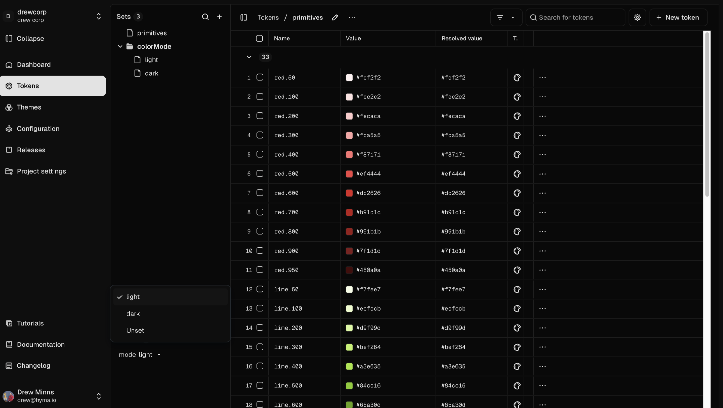
Token Set
A collection of design tokens. You might have separate token sets for different variations (e.g., light, dark).
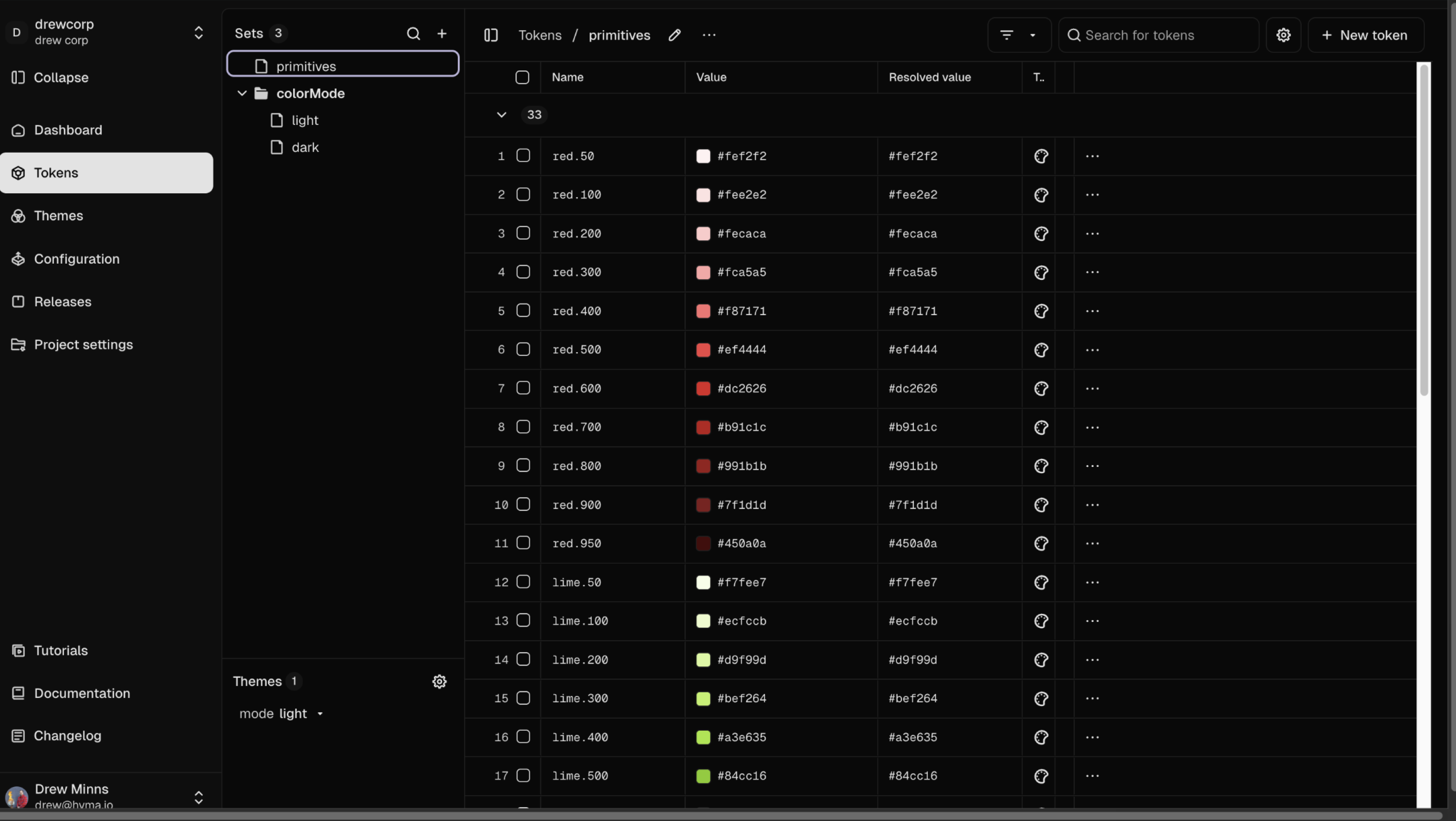
You can read more about Token Sets here.
Theme Group
A container that holds related design variations. Think of it as a category for organizing similar theme choices (e.g., "Color Mode").
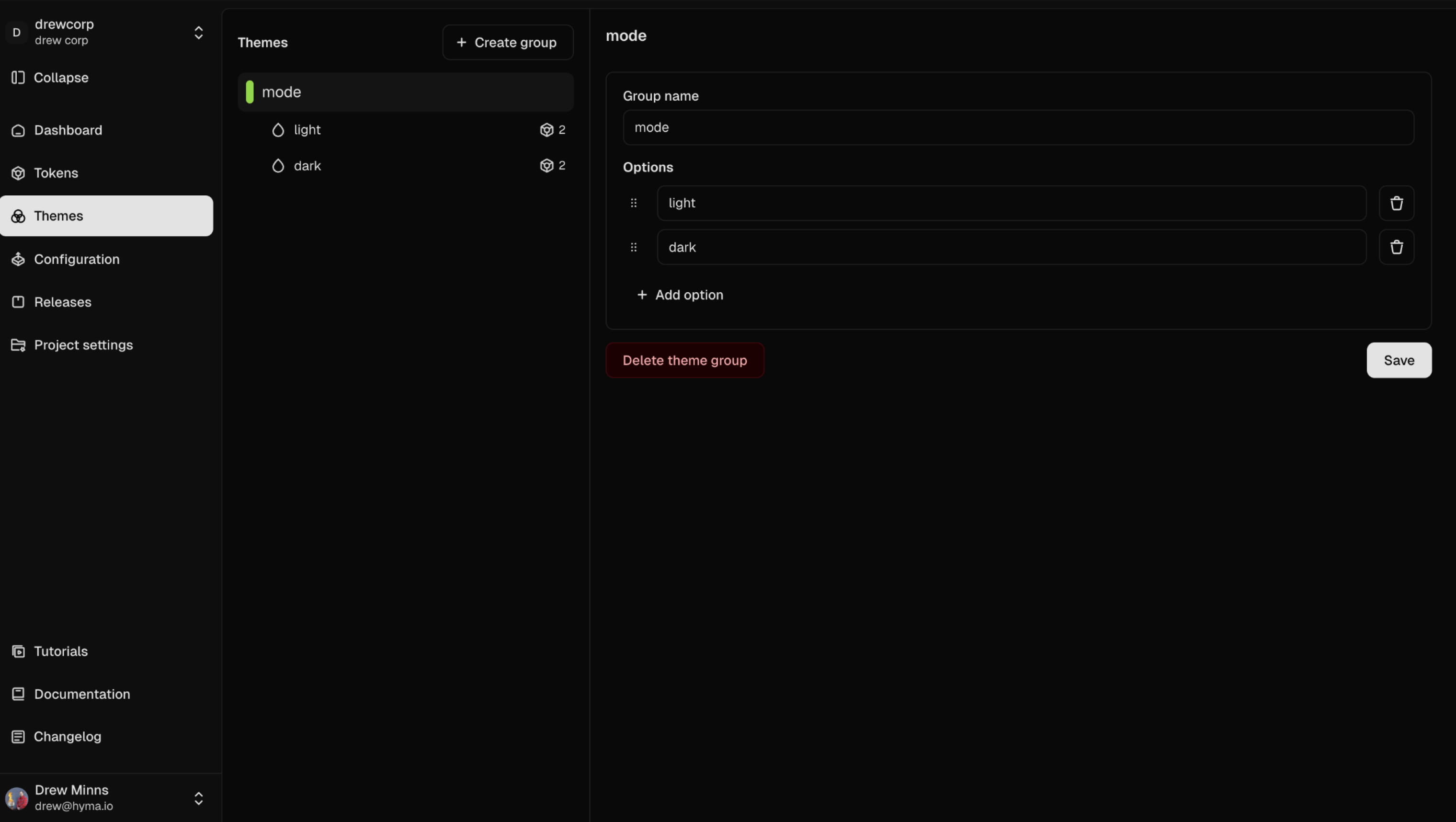
Theme Option
A specific variation within a theme group. These are the actual themes you can switch between (e.g., "Light" or "Dark").
When you export your Light theme, you get a clean light.css file with all the right token values. When you export your Dark theme, you get a separate dark.css file with the dark values. Both files use the same token names like primary.background, but the exported values are different - and all token references are automatically resolved for you.
Examples
- Theme Group: "Color Mode" → Options: "Light", "Dark"
- Theme Group: "Breakpoints" → Options: "Mobile (320px)", "Desktop (1440px)"
- Theme Group: "Brand Variants" → Options: "Primary Brand", "Partner Brand"
INFO
Curious how these relate to Figma?
- Each Theme Group will create one Figma Collection
- Each Theme Option will create one Figma Mode within that collection
Setting up Theme Groups
Creating a Theme Group
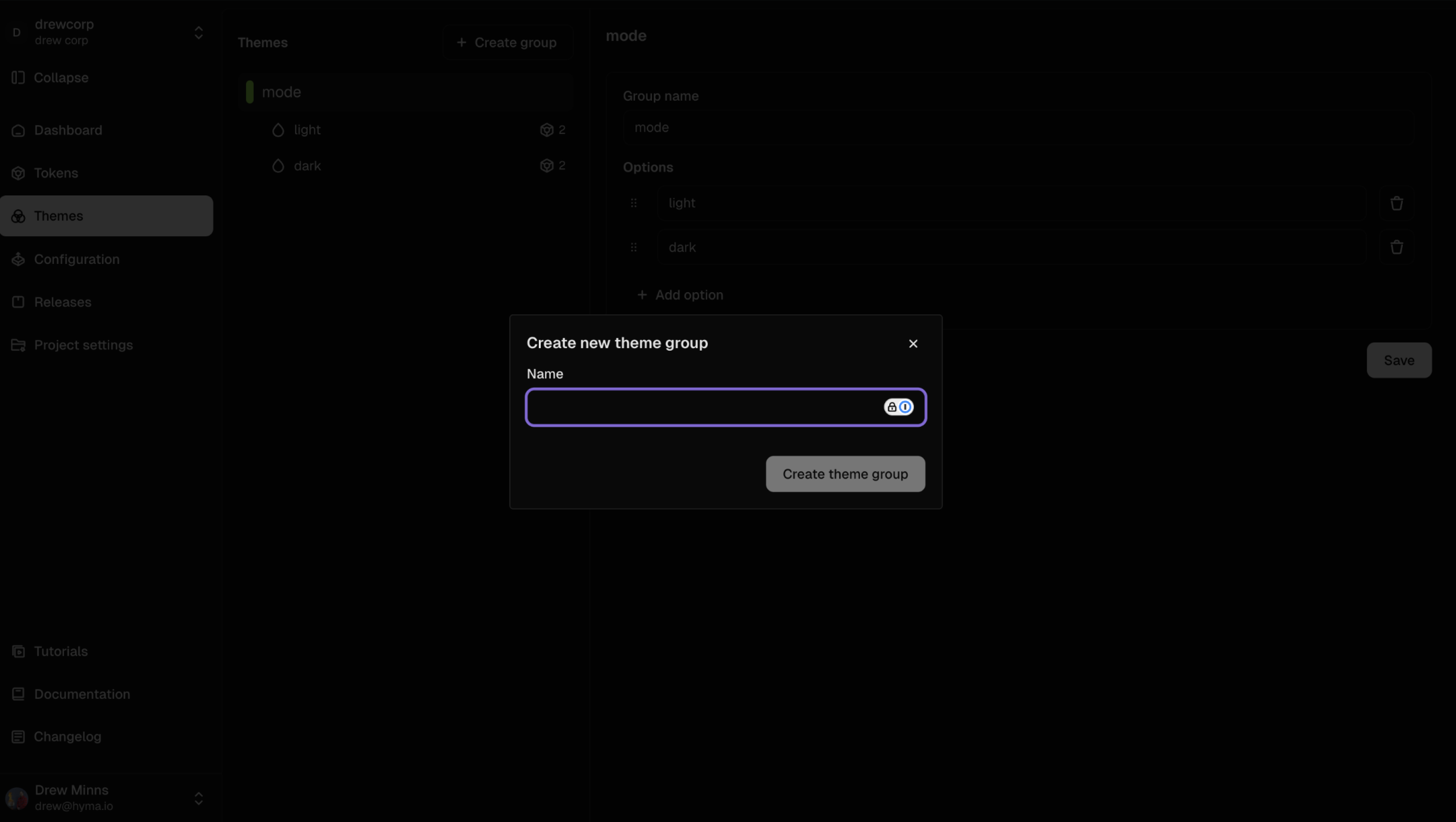
- Click the "Themes" link in the navigation sidebar
- Click Create New Theme Group
- Enter a descriptive name (e.g., "Color Mode")
- Add your first theme option (e.g., "Light")
- Click Save
Adding Theme Options
- Inside your theme group, click Add Option
- Name the option clearly (e.g., "Light Mode")
- Add a description if helpful (optional)
- Click Save
INFO
Important: While you can create more than four theme options, only four will work in Figma if you're on the Organization plan (Enterprise plans support more).
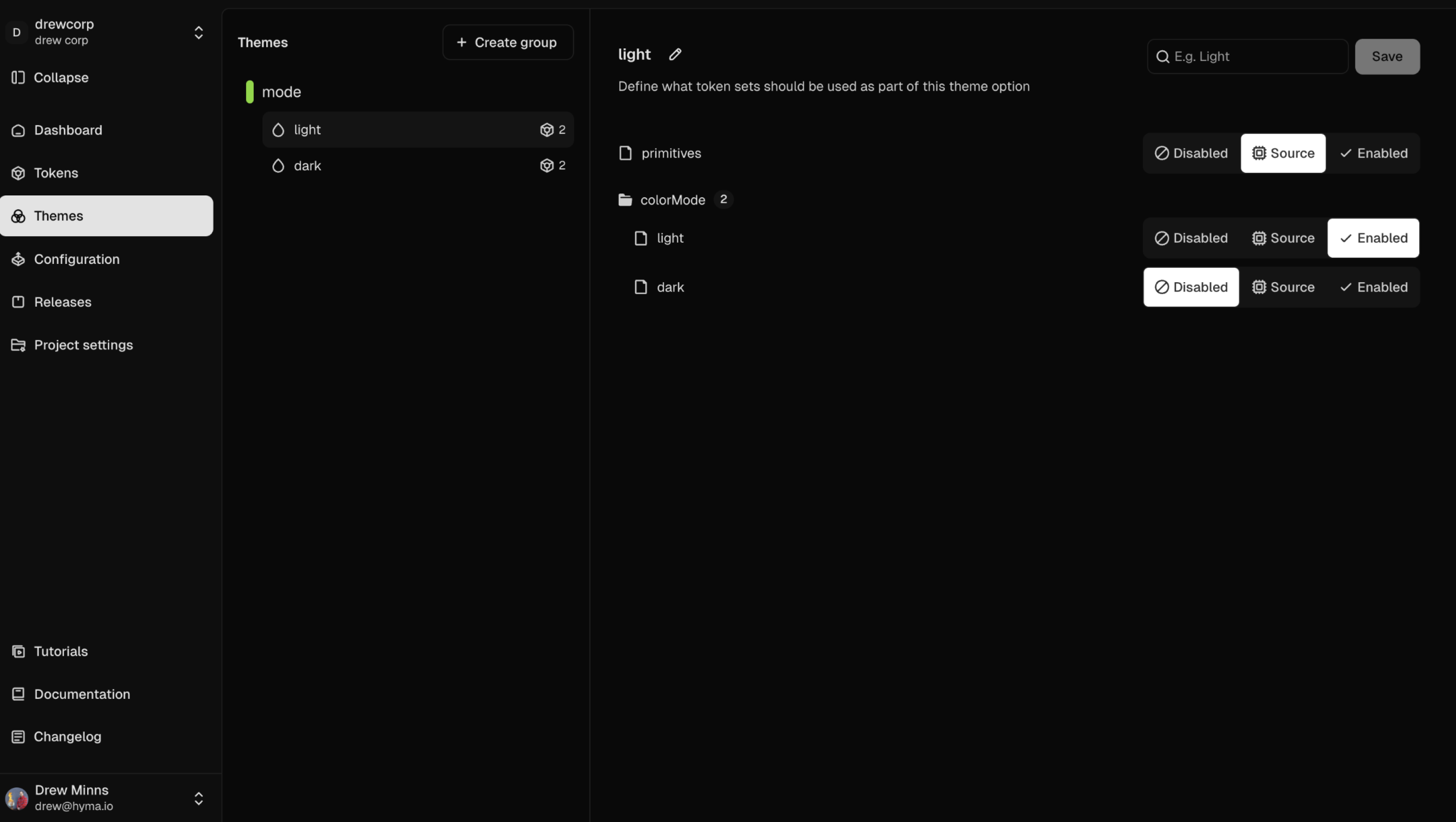
Connecting Token Sets to Theme Options
Each theme option needs to know which token set (JSON file) to pull its values from. This is how you tell the system "when Light theme is active, use the values from the colorMode/light token set".
How to Set Up Token Sets
Each Theme Option can have different token sets assigned to it. This defines which tokens are active when the theme is selected.
- Select a theme option (e.g., "Light Mode")
- Enable your main token set (e.g., "Light Token Set")
- Enable any token sets that contain referenced tokens as sources (e.g., "Primitives Set")
- Repeat for each theme option
Referencing other Token Sets
You may have Token Sets that reference another Token Sets. For example, a light and dark token sets may reference the primitive colors or other token sets. Both themes might have primary.background tokens that reference lime.600 and lime.400 respectively, from a shared primitives set.
When you export your light theme to light.css, those references to lime.600 need to be resolved to actual color values. If the primitives set isn't included, you'll get broken references instead of working CSS.
To achieve this, enable primitive sets as "sources" so they get included in your exports and all references resolve properly.
Example Setup with Sources
Let's say your colorMode/Light Token Set contains semantic tokens like primary.background that reference primitive tokens like lime.400 from a Primitives Token Set:
- Light Mode → enables "Light Token Set" + "Primitives Set" (as source)
- Dark Mode → enables "Dark Token Set" + "Primitives Set" (as source)
Result
When you export your Light theme, you get a clean light.css file where button.background.primary shows the actual hex value from blue.400, not a broken reference. The primitives are automatically included and resolved.
INFO
Don't forget to set your sources in all theme options
When your theme's tokens reference tokens from other sets, those referenced sets need to be enabled as sources in all options that need them. In the example above, both Light and Dark token sets reference lime.400, from the Primitives Set, so the Primitives Set must be enabled as a source for both themes to work properly.
Using your Themes
Switching Between Themes
- Look for the Active Theme Selector at the bottom-left of the Tokens Module
- Choose your desired theme combination (e.g., "Default + Light" or "Default + Dark")
- The interface will update to show the selected theme's token values
Managing Existing Themes
- Delete a Theme Group: Go to Themes panel → Select group → Click Delete
- Remove a Theme Option: Navigate to the group → Select option → Delete
Common Use Cases
Theme Groups work well for organizing:
- Light/Dark modes for accessibility and user preference
- Brand variations when supporting multiple brands or partners
- Responsive breakpoints for different screen sizes
- Accessibility themes like high contrast modes
- Seasonal themes or special event styling
- A/B testing variations for design experiments
Key Benefits
- Centralized management: All your design variations in one place
- Easy switching: Test different themes without manual token changes
- Figma integration: Automatically syncs with Figma's variable collections
- Scalable organization: Add new variations without restructuring existing work
[^1]: